Every few weeks someone sends me a screenshot of an AI leaderboard and asks the same thing. Which one should we use?
Usually they've already circled the model at the top. It's the smartest, so it must be the safest pick. And that's how a lot of teams end up paying four or five times more per task than they need to, for a score they'd barely notice.
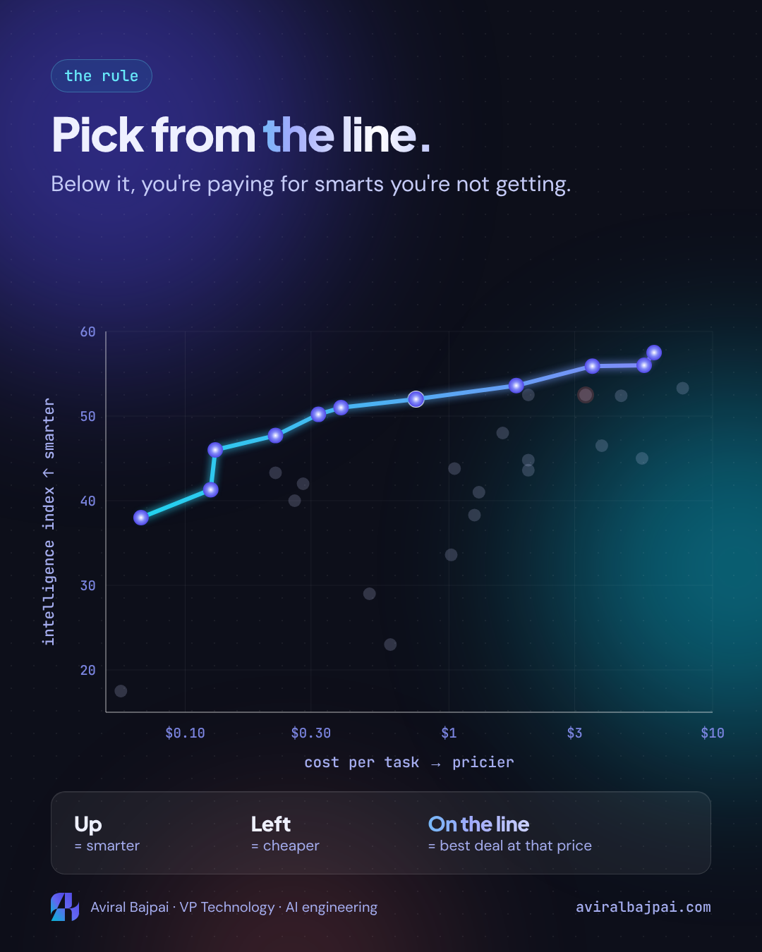
The chart that fixes this has been sitting on Artificial Analysis for a while. It plots every major model by how smart it is against what it costs to run. Most people glance at it, find the highest dot and move on. The useful part is the dotted line running along the top-left edge. It's called the Pareto line, and once you know how to read it, picking a model gets a lot simpler.
This post is for people who've never looked at one of these charts properly. No maths background needed.
The 43-second version:
Watch the explainer video or view the final frame as an image.
Step 1: the vertical axis is an exam score
Artificial Analysis runs every model through the same exam. The current version of their Intelligence Index (v4.3.2) is made up of 10 evaluations: agentic knowledge work, real-world job tasks, terminal and coding work, long documents, hard reasoning questions and a hallucination check, among others.
Each model gets one combined score. Higher means smarter. On the October 2026 chart the scores run from the high teens up to the high fifties.
Think of it like a standardised test. It doesn't tell you everything about a candidate, but it's the same test for everyone, which is what makes comparison possible.
Step 2: the horizontal axis is the bill
The other axis is cost per task: what you actually pay the model's API to complete one of those exam tasks, averaged and weighted across the whole index.
This matters more than the price-per-million-tokens number you see on pricing pages. Two models with the same token price can have very different bills, because one might "think" for ten times as many tokens before answering. Cost per task captures that. It's the closest thing to a real invoice.
One detail trips people up: the axis is on a log scale. The gap between $0.10 and $1 is drawn the same width as the gap between $1 and $10. So two dots that look a short distance apart can be several times different in price.
Step 3: read the chart by direction
Put the two together and every dot is one model.
up      = smarter
left    = cheaper
top-left corner = where the good deals live
That's all the reading you need. A dot that's higher and further left than another dot beats it on both counts.
Step 4: spot a bad deal
Here's where it gets useful. Take two OpenAI models from the chart (all values read off a log-scale chart, so approximate):
model                  score    cost per task
GPT-6.1 Sol (max)      ~52      ~$0.75
GPT-6 Astra (max)      ~52.5    ~$3.30
Same height on the chart, so roughly the same score. But Astra sits about four times further along the price axis. For most workloads you'd be paying 4x for no visible gain.
It's not the only one. Grok 4.7 (xhigh) scores ~46.5 at ~$3.80 a task: about five times Sol's price for a lower score. Gemini 4 Argon (high) lands around ~52.5 at ~$2, close to Sol's score at well over double the cost.
None of these are bad models. They're just not the best deal at their price on this particular test.
Step 5: join the best deals, and you have the Pareto line
Now connect every model that nobody beats. That means no other model is both cheaper and smarter. The line you draw through them is the Pareto line (or Pareto frontier).
on the line     = best score you can get at that price
below the line  = some other model does more for less
On the October chart the line starts with GPT-6 Luna (max) at ~38 for ~$0.07 a task, climbs through MiMo-V2.6-Pro at ~46 for ~$0.13, reaches GPT-6.1 Sol at ~52 for ~$0.75, and tops out around ~57 at roughly $6 a task with the Claude 5.5 family.
What this changes
You stop shopping by rank. The question becomes "what's on the line near my budget?" rather than "who's number one?"
You can start from either constraint. If you have a budget, find it on the price axis and go straight up until you hit the line. That's the smartest model you can afford. If you have a quality bar, find that score and go straight right until you hit the line. That's the cheapest model that clears it.
You see where the curve flattens. This is the part I find most useful for leadership conversations. The line climbs steeply on the left and almost goes flat on the right:
cost per task      best score on the line
~$0.07             ~38
~$0.13             ~46
~$0.75             ~52
~$6                ~57
Going from ~$0.75 to ~$6 a task is about 8x the spend for roughly 5 more points. Sometimes those 5 points are worth it. Often they aren't, and the chart makes that trade-off visible in one glance.
Some popular picks sit below the line. Even Claude Haiku 5.5 (max), which I wrote about last week as a great-value model, sits a little under the line here: MiMo-V2.6-Pro scores higher for less on this index. That doesn't make Haiku a bad choice. It means the reason to pick it has to come from something the chart doesn't show.
What it doesn't tell you
It's one exam. The Intelligence Index is a broad mix. Your workload might be all coding, all document extraction or all customer chat, and models can rank differently on narrow tasks. Artificial Analysis publishes separate coding-agent and domain indexes for exactly this reason.
Speed and latency aren't on it. A model on the line might be too slow for a real-time product.
Effort settings move dots. Most labels say "max" or "high". The same model at a lower reasoning effort is a different dot, usually cheaper and a bit lower. You might find a variant that's on the line for your budget even if the max setting isn't.
It's a snapshot. Prices drop and new models land weekly. The line I've described is from 13 October 2026, and it will look different within a month.
Other constraints matter too. Open weights, data residency, rate limits, vendor terms and what your team already runs in production can all outweigh a few points of score.
How I'd use it
- Write down your constraint first: a budget per task, or a minimum quality bar.
- Find it on the chart and move straight up or straight right to the line.
- Take the two or three models on the line nearest that point as your shortlist.
- Run them on 50 to 100 real examples from your own work and compare the actual output and the actual bill.
- Re-check the chart every quarter, because the line keeps moving left.
Stop asking which model is smartest. Ask which one is on the line at your price.
Sources: Artificial Analysis, Intelligence Index vs. Cost per Intelligence Index Task (chart as of 13 Oct 2026; all scores and costs here are read off a log-scale chart and are approximate), Artificial Analysis Intelligence Index methodology. Related: Haiku 5.5 thinks like a flagship and bills like a budget model